

Feb. 2019
UX Research
Design Sprint
Rapid Prototyping
Interface Design
This work is a product of following one of the design briefs provided by the RSA Student Design Awards.
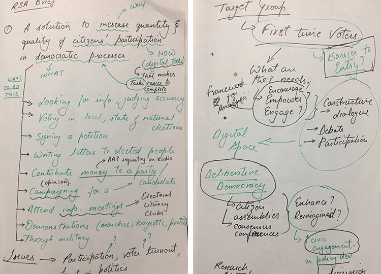
Brief- Design a solution that harnesses digital tools to increase the quantity and quality of citizens’ participation in democratic processes.
With help from my mentor, Saumya Kharbanda, I was able to set first-time voters as the target group and identify a broad framework for an inquiry into the Indian political sphere.
3E Framework- Encourage, Engage, Empower.
The next step was to create a road-map for interviewing urban first-time voters. All questions were inclined towards finding their political interest against political awareness.
Here are some of the leading insights-
A sense of responsibility piques political interest.
Family leaves political impressions.
Feels political awareness is time-consuming.
Facebook is a passive news touch-point.

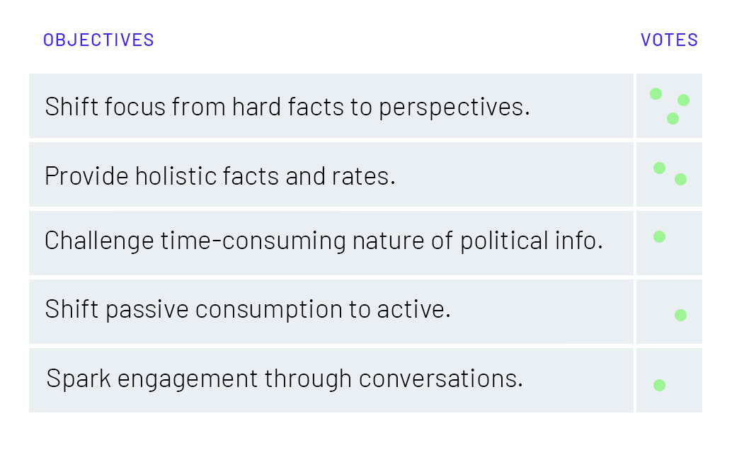
These insights informed the next step of defining specific objectives and goals. Next, I gathered my peers (also first-time voters) to help me prioritize them by voting.
After prioritizing, I brainstormed and generated 3-4 solutions for each of the objectives.The idea here was to generate first, and critique later.
To critique the generated rough ideas, I mapped them out on an Impact-Effort graph. The value against the effort required to build the solution before elections (April 2019).
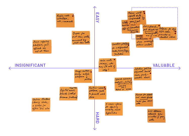
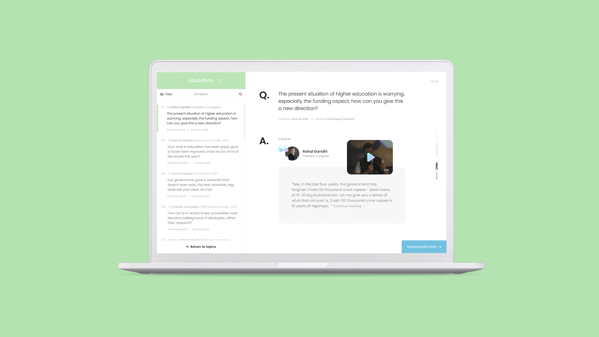
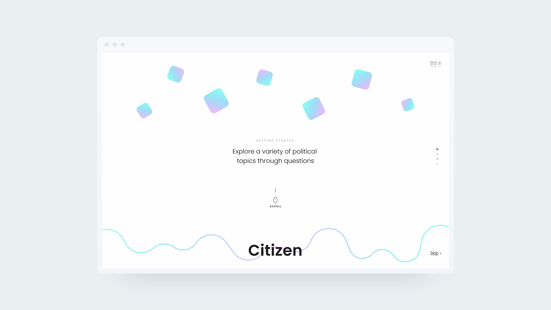
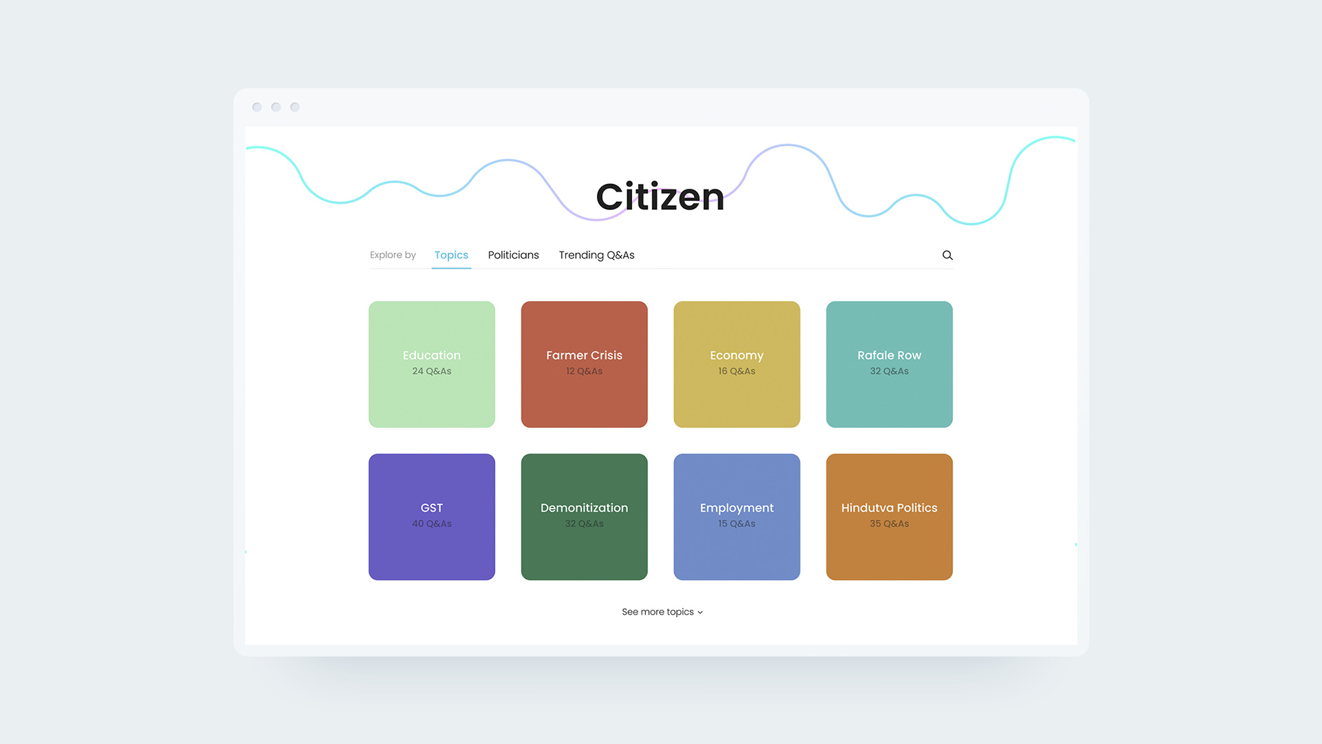
Selected Concept- A platform to present long Q&A videos of politicians in a direct, digestible, and interactive format.
Encouraging the “question-asking” notion of students, this idea also meets two of the above defined objectives-
Shift focus from hard facts to perspectives.
Challenge time-consuming nature of politics.
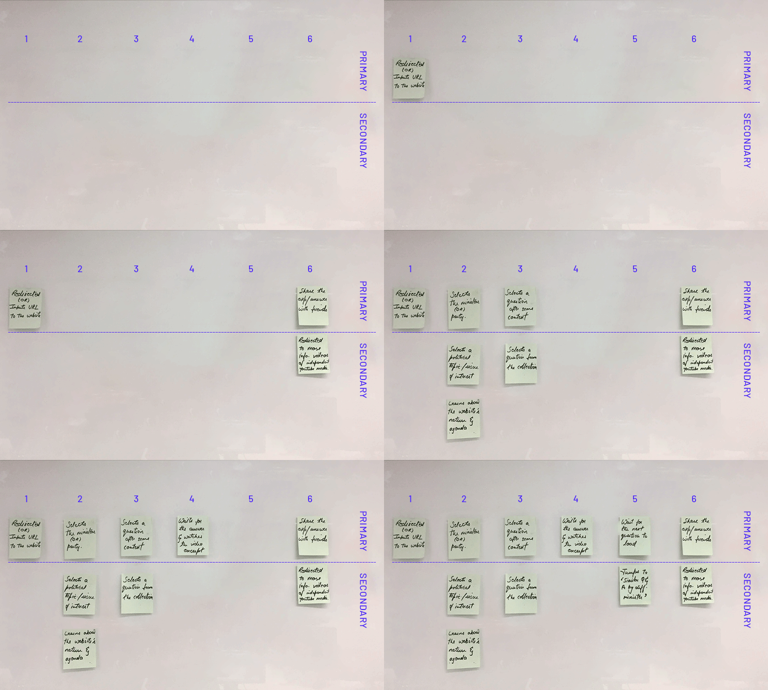
To give this concept more structure, I followed three steps to go from a macro to a micro view.
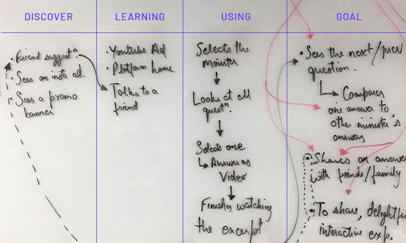
Macro flow to layer the 3E framework.
Micro flow to identify primary and secondary userflow.
User Testing with target group.
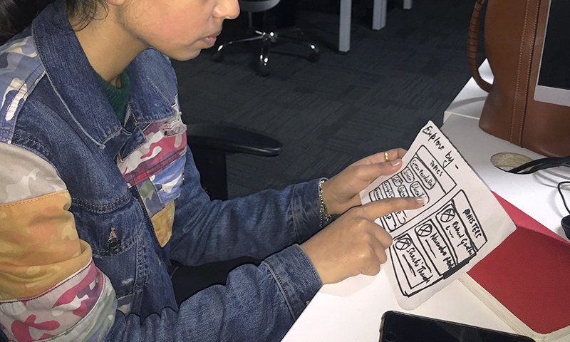
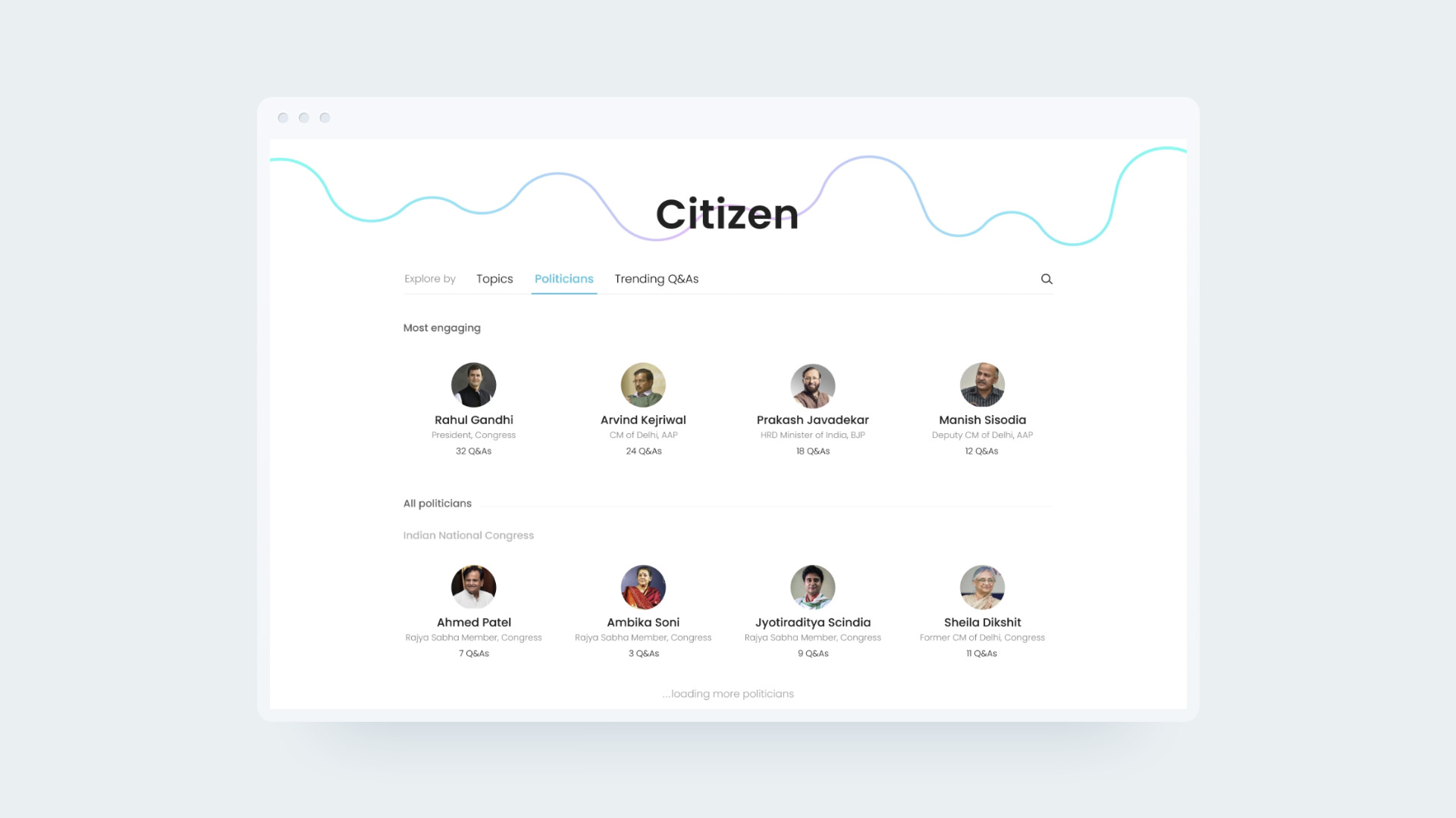
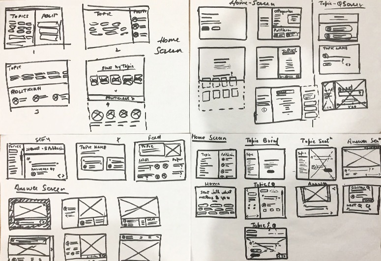
After articulating questions that users might have at each step of the flow, I initiated the wireframing process, again following the generate first, critique later method.
The final translation of the UI from wireframes happened over multiple iterations that revolved around the identity, functionality, hierarchy, and features of the platform.
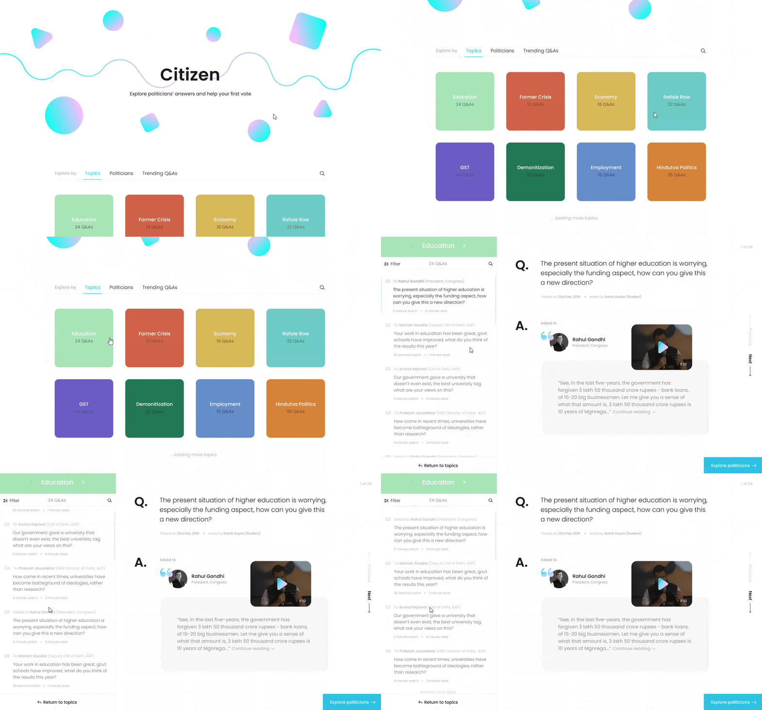
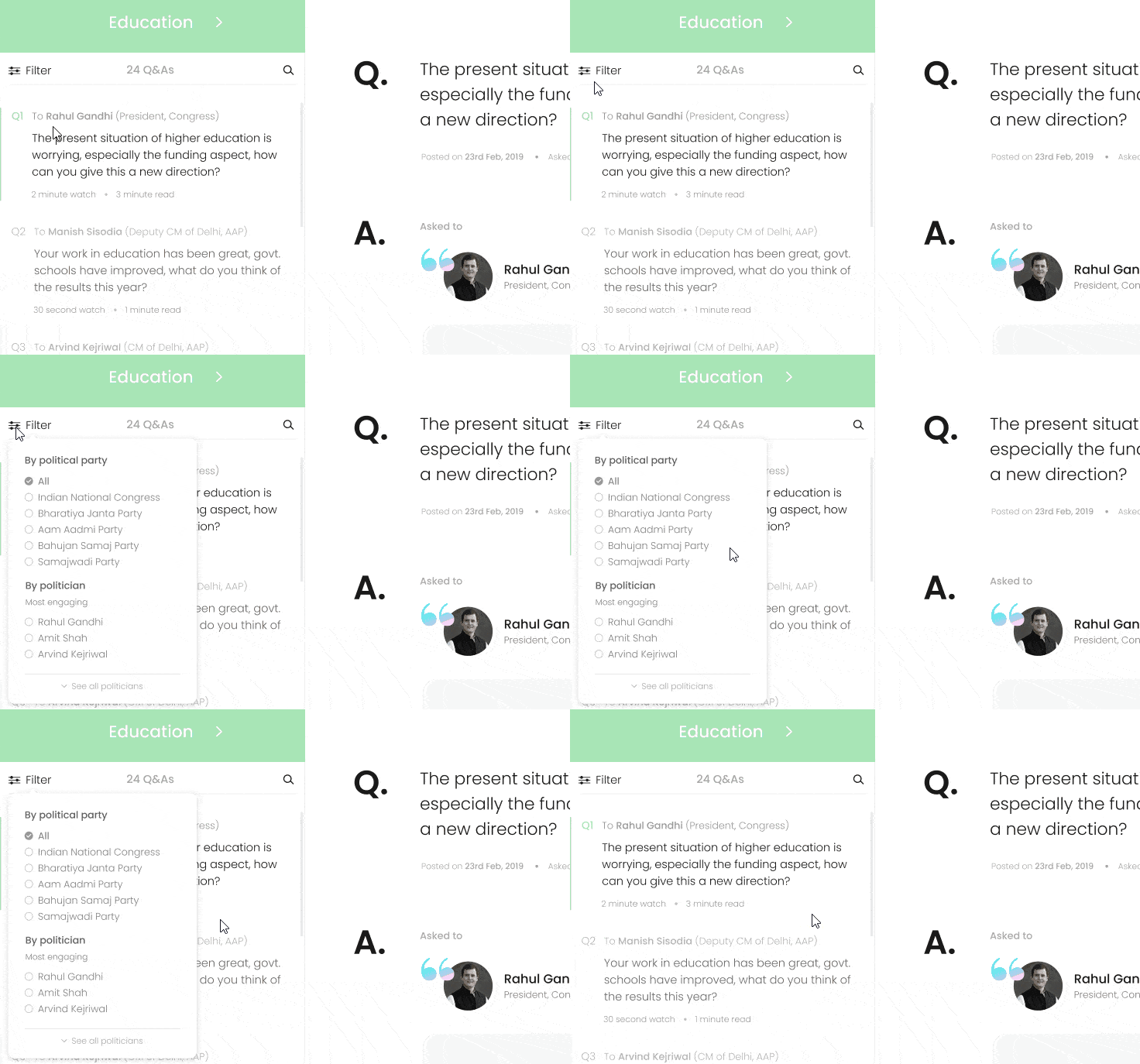
Filtration to close-in on interests.
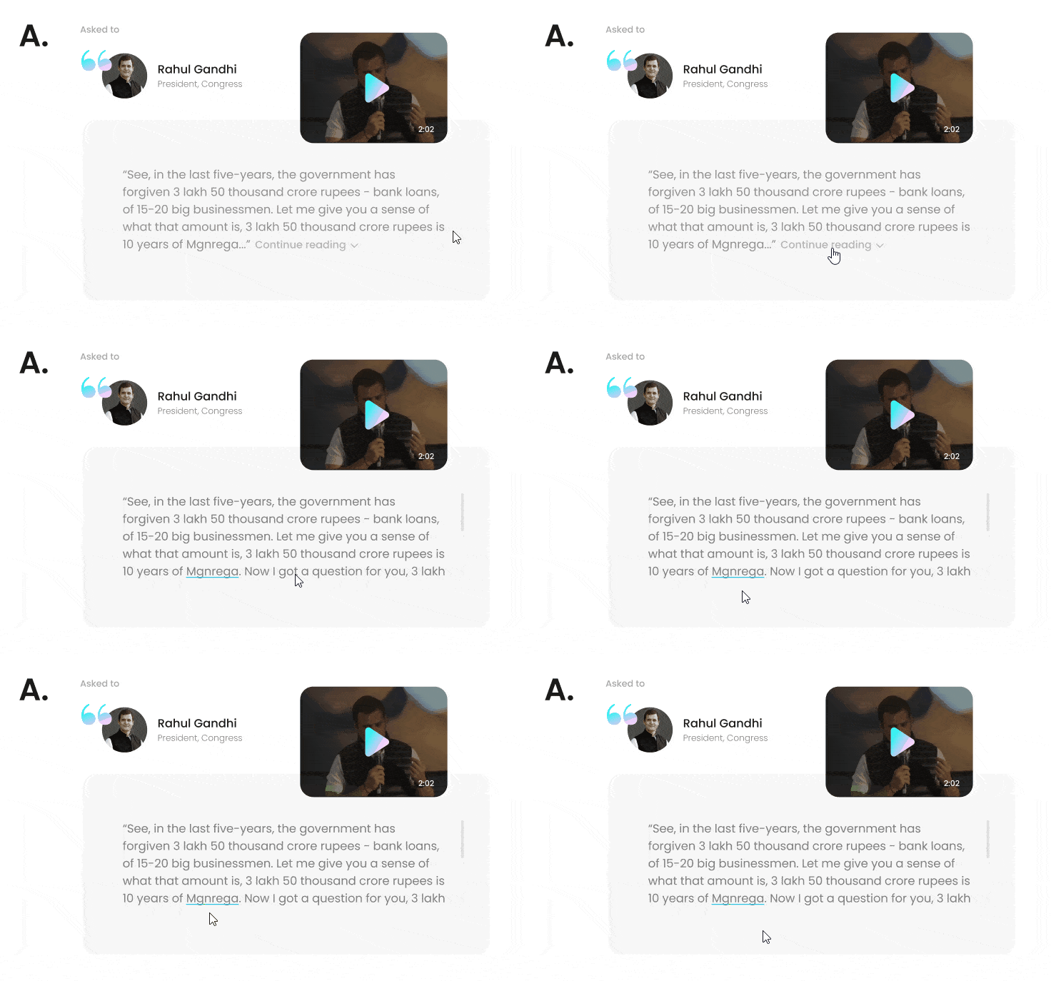
Citizen Dictionary to fill knowledge gaps.
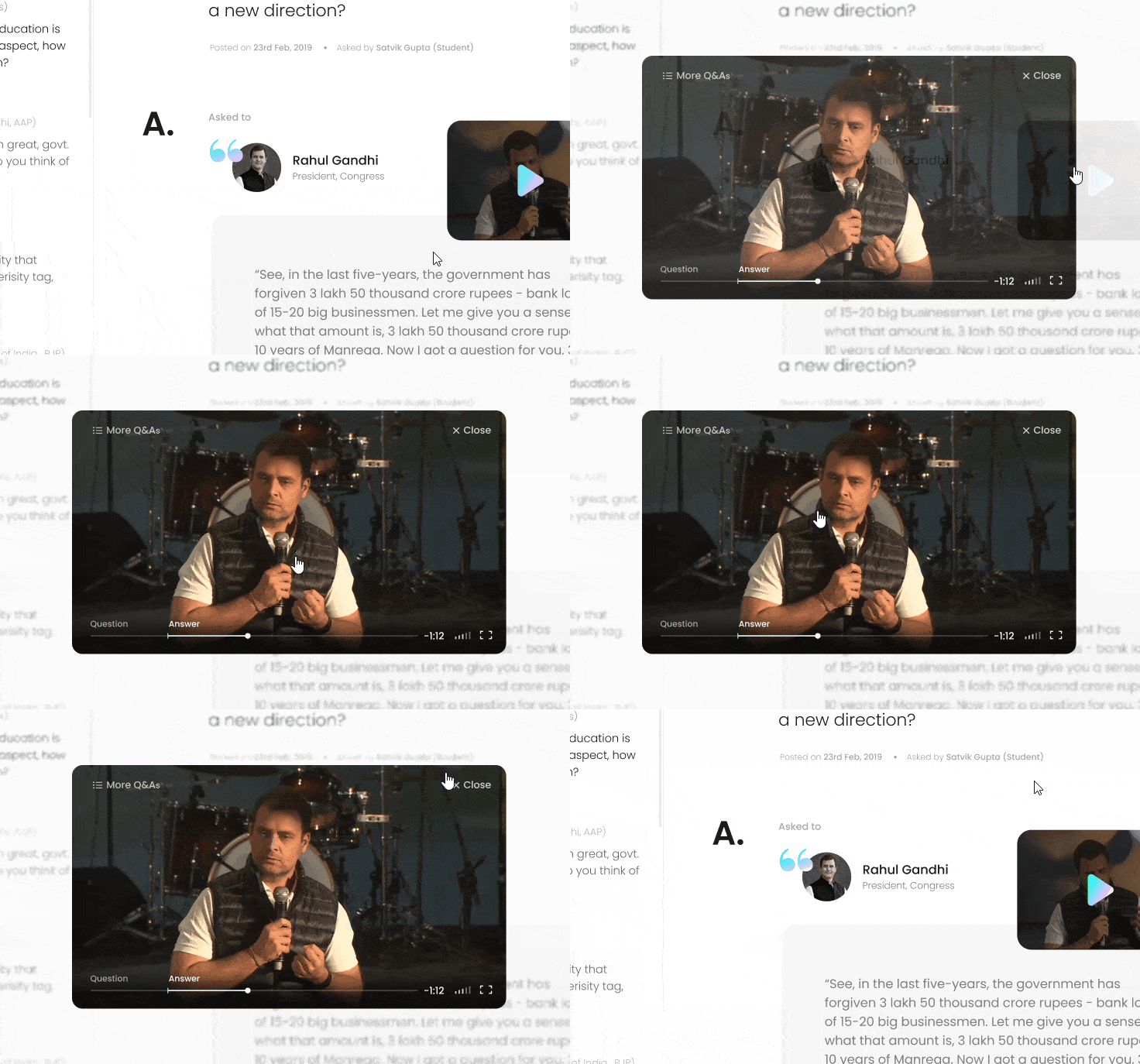
Video pop-up to switch medium.
Design can address issues like politics, if you're willing.
Impact-Effort graph accelerates decision making.
Solutions generate when you have clear objectives.
When in doubt, strategically ask the user for help.
Build and impulsively initiate testing.