

Nov. 2018
Digital Humanities
User Interaction
Data Visualization
Sound Design
Visual Design
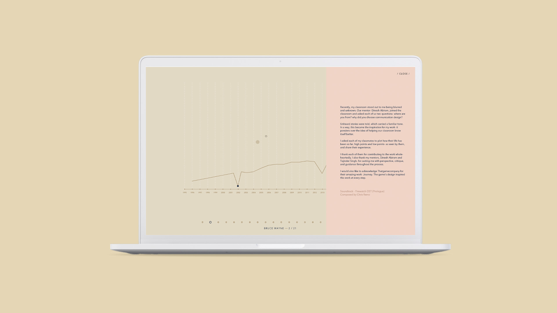
When our mentor- Dinesh Abiram, joined my classroom and asked each of us where we are from, unheard stories were told, which carried a familiar tone.
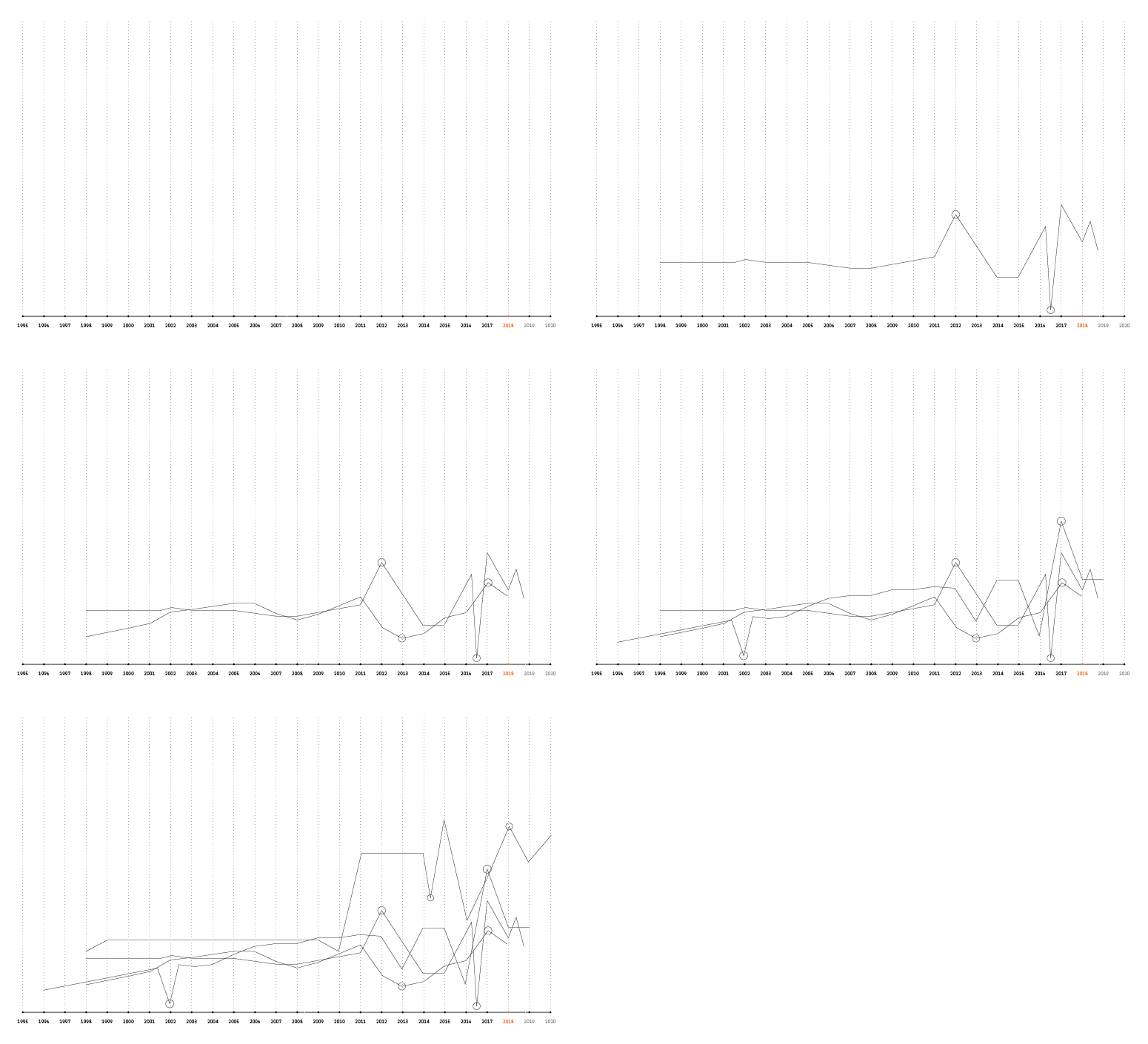
This work ponders over the idea of helping a classroom know itself better. I asked each of my classmates to plot how their life has been so far, high points and low points- as seen by them, and share their experience.
To start the process, I made a grid on Illustrator. This way, people could easily plot their graph on it using the pen tool.
Then, I fetched-in my classmates one-by-one to make their graph, and recorded their voice as they spoke.
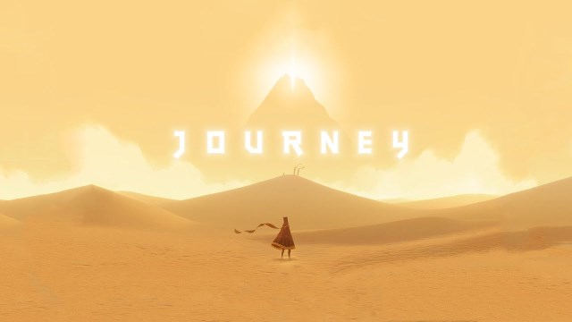
To create a safe space that can harbor our stories, “Vessel” had to keep social-trust in its essence. A key philosophy - make the world more powerful than the player, was drawn from the design of the game “Journey” (2012).
I translated it to the experience — the interface doesn’t seek the user, the user seeks the interface.
In this digital environment, I saw the cursor as the only rendition of the user. So, I changed the cursor to be more feedback-friendly.
The new cursor was designed to give three feedbacks-
Fluidity as one circle follows the other.

Glow when interactive element is found.
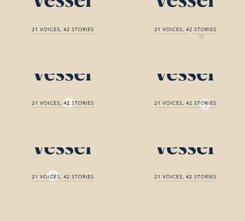
Merge over each-other and interactive elements.

Each of these feedbacks suggests these three notions - subjectivity, sensitivity, and connection.
The voice notes picked up static noise. To sustain the listening experience, I exported each file through Premiere Pro’s adaptive noise reduction filter.
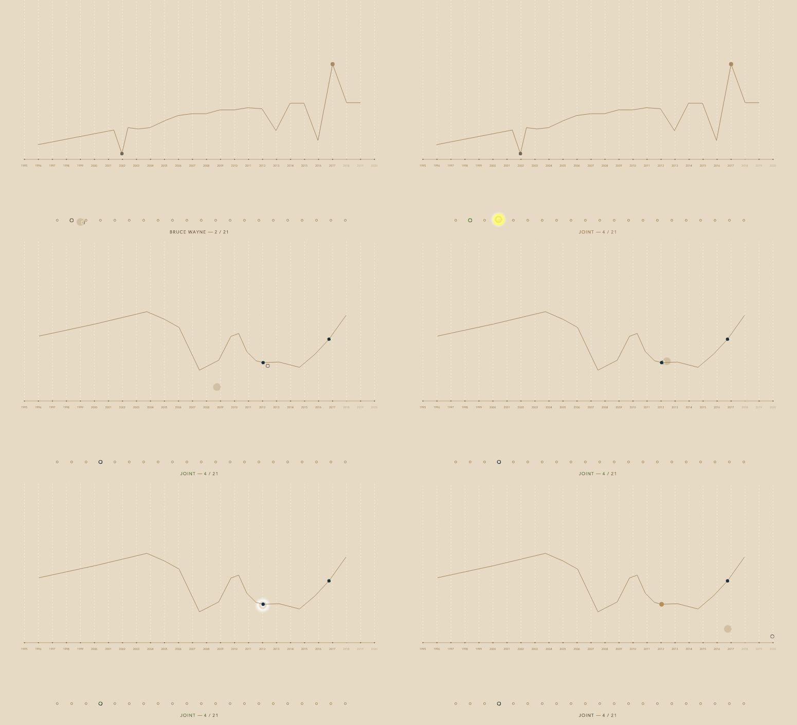
For the graphs, the SVG code was directly embedded into the HTML code, maintaining the location and dimensions of the graphs on the grid.
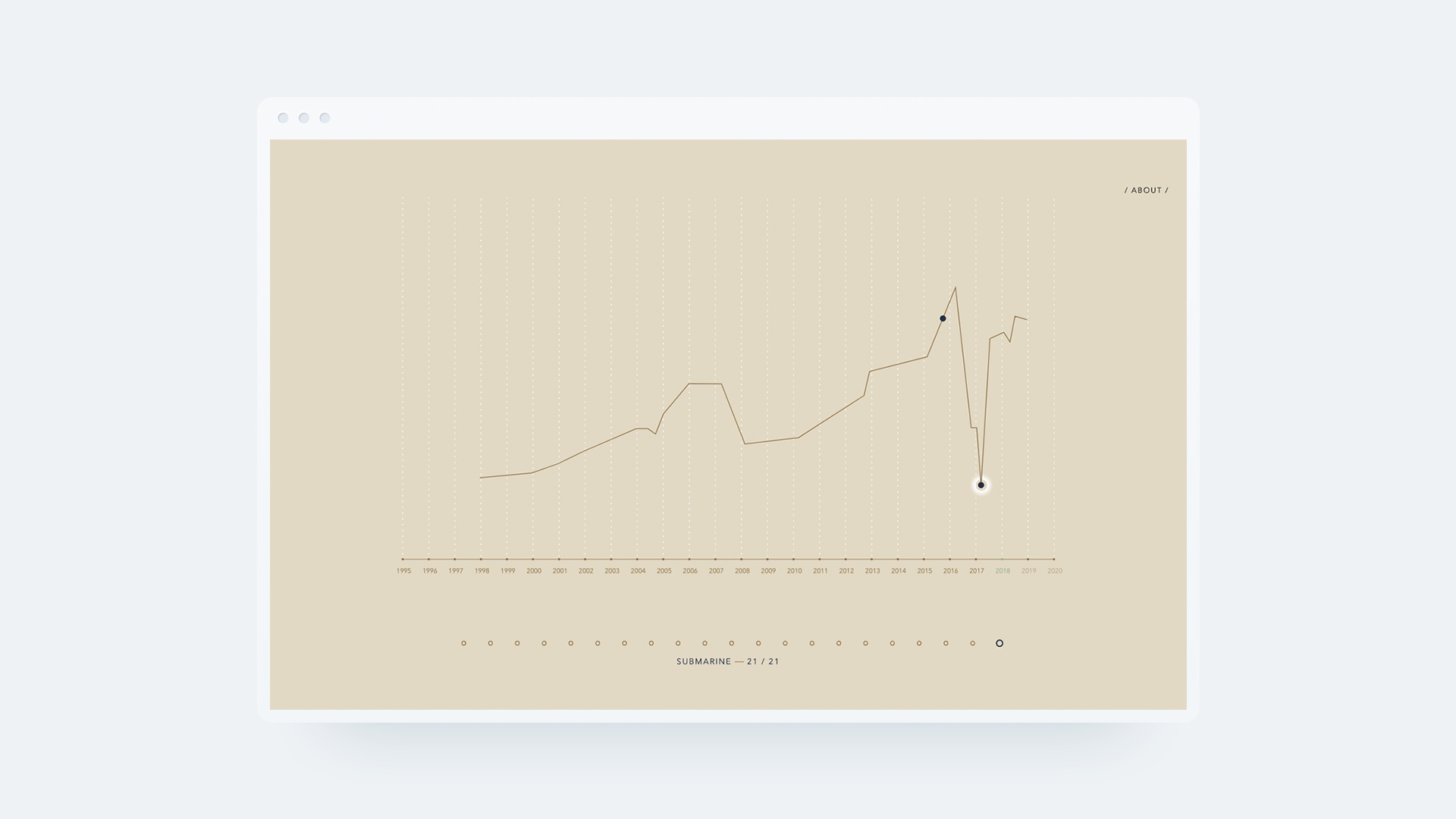
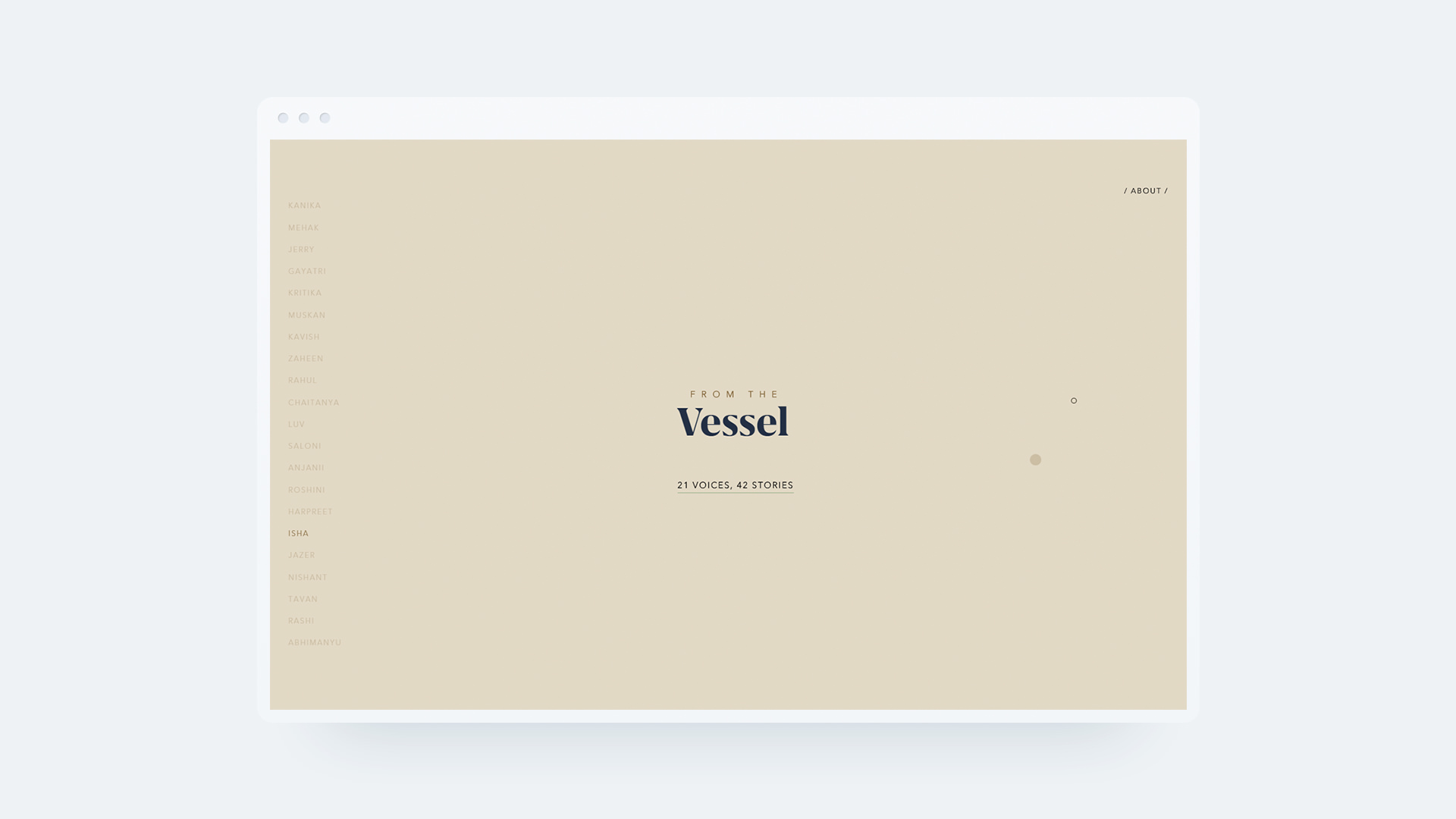
The interface of the website has two screens. This first screen is the 'known world' — my classmates are familiar with their names on the left side of the UI.
They can enter the 'unknown world' from here.
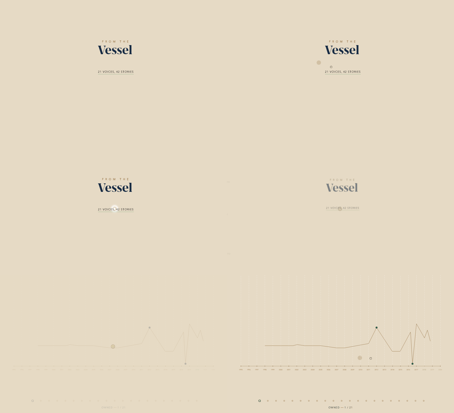
This second screen is the 'unknown world' — names are replaced by random words. This anonymity gives an opportunity to my classmates to hear out unknown stories.
Don't disregard a simple idea.
Learn interaction concepts from artistic games.
Be transparent with people and earn their trust.
Emotions can translate to design through feedbacks.
Borrow Apple earphones if you need a good mic urgently.